


Photo by Rodion Kutsaev on Unsplash
Create a basic android custom view component under 10min - Part 1
A total beginner's guide to creating custom view components 😋


Do you want to create a button-like, textview-like android component which will be reusable throughout your project? You have come to the right place! I promise this is not going to be overly technical, it is straight to the point. 😅
Android offers us a way to build custom UI elements 🧑🏽🏫. Honestly, if you are interested in reading more about that fun fact I suggest you go through the doc. We are trying to make something in 10mins here! - lazy lazy devs..🙃
For the purpose of this lesson I am going to create a static custom view component which is a profile header. The view component will be reusable throughout multiple layouts. Now that I think of it💡, it can also be used as an item layout for a recycler view in future - hmm!
Okay, lets begin
Step 1: Create a new empty project, give it a smart name.
I named mine - Customcomponents101 , I dont have a screenshot of that - sorry. Your project should have a basic MainActivity.kt and layout_activity_main.xml
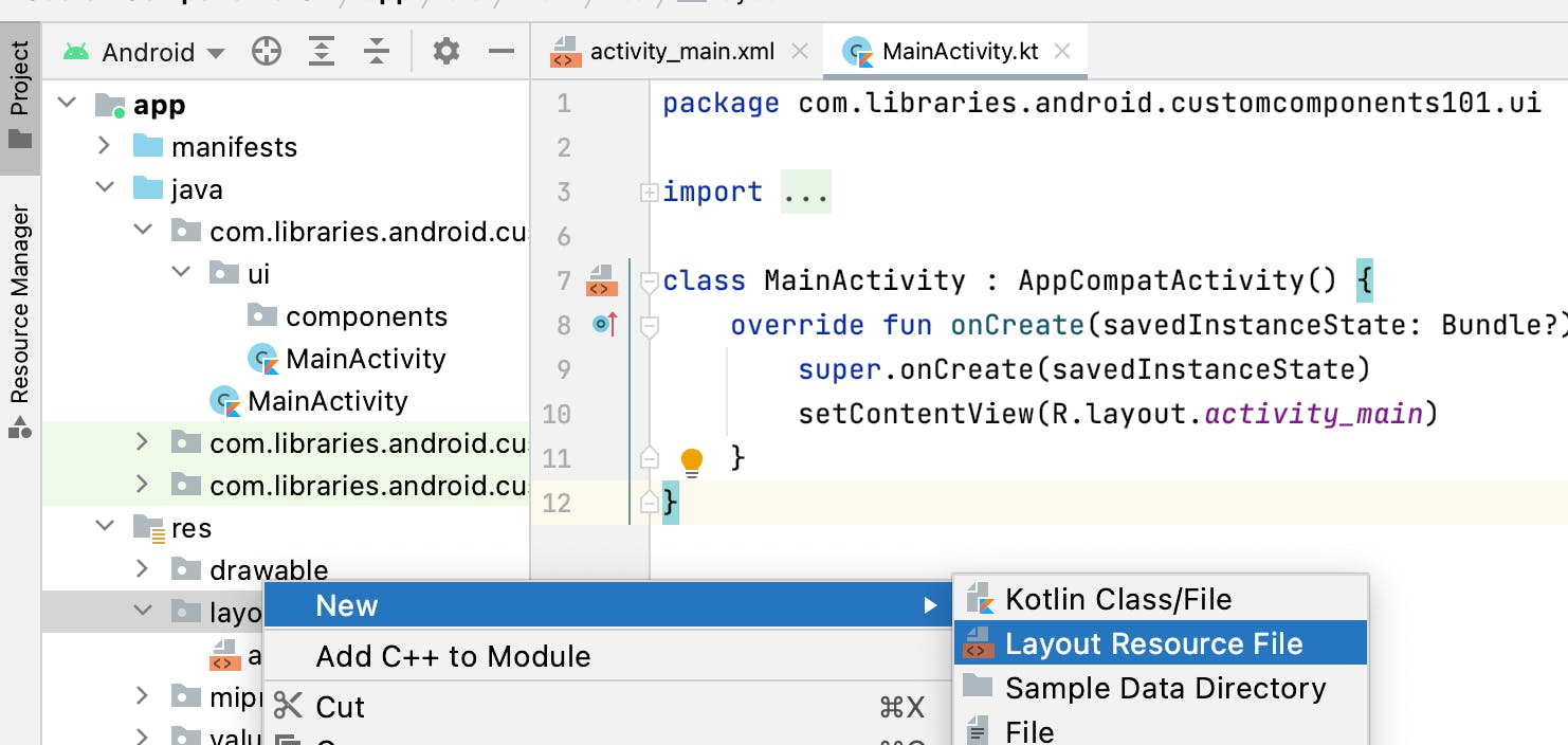
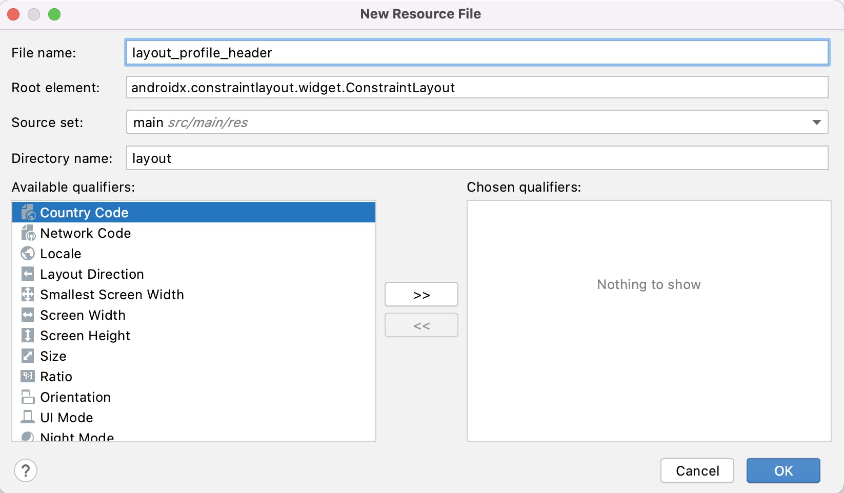
Step 2: Go to the res folder and create a new layout.
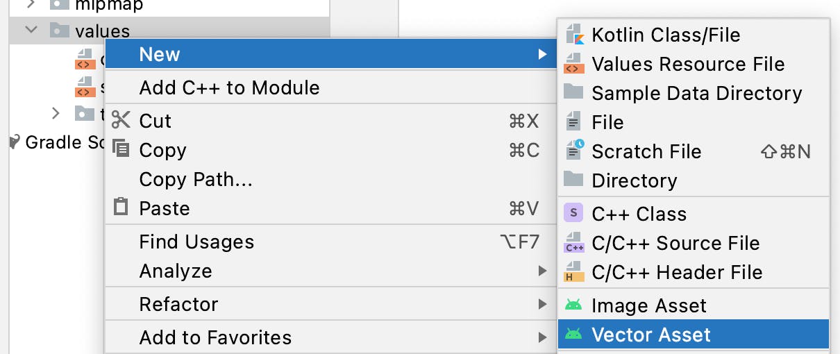
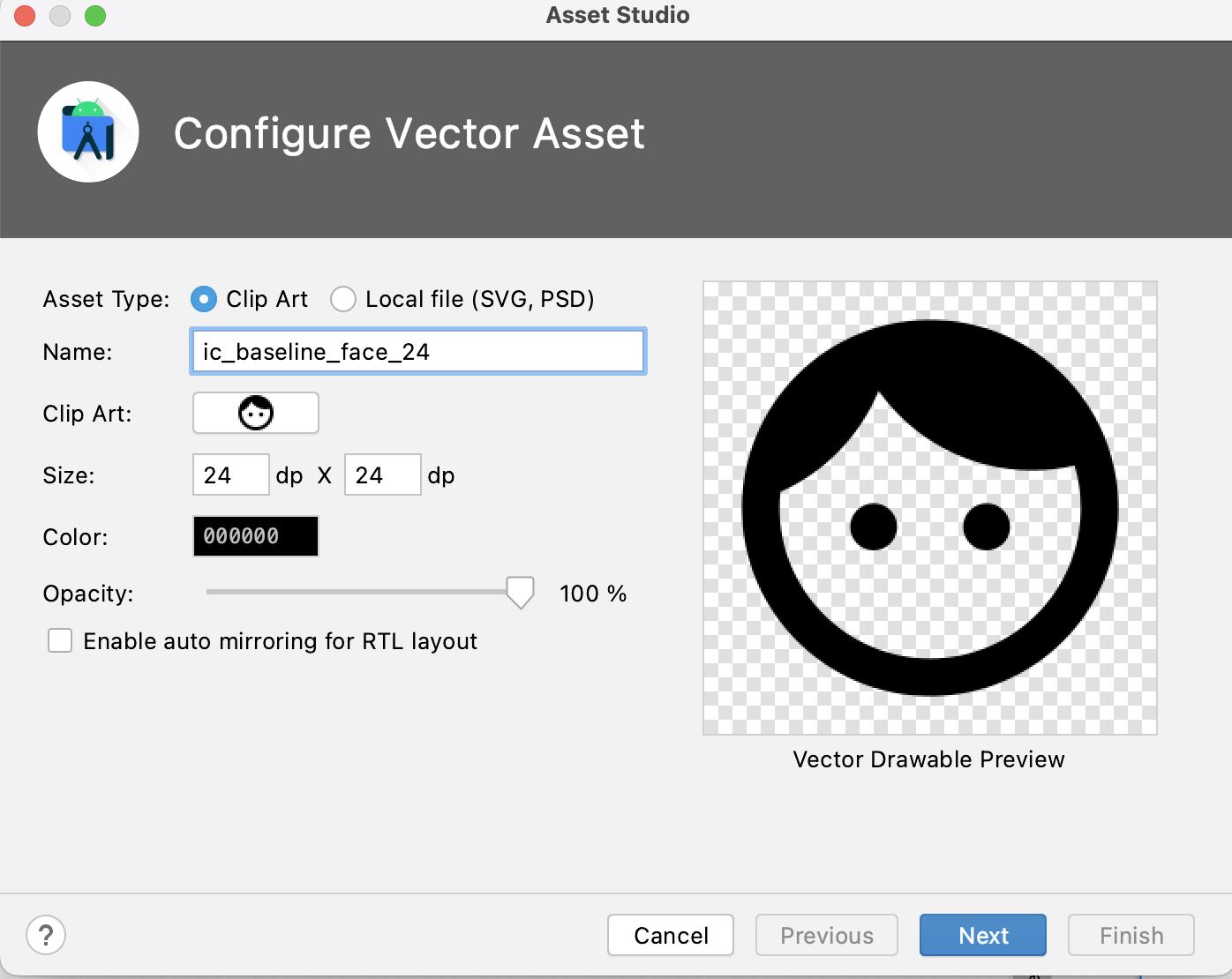
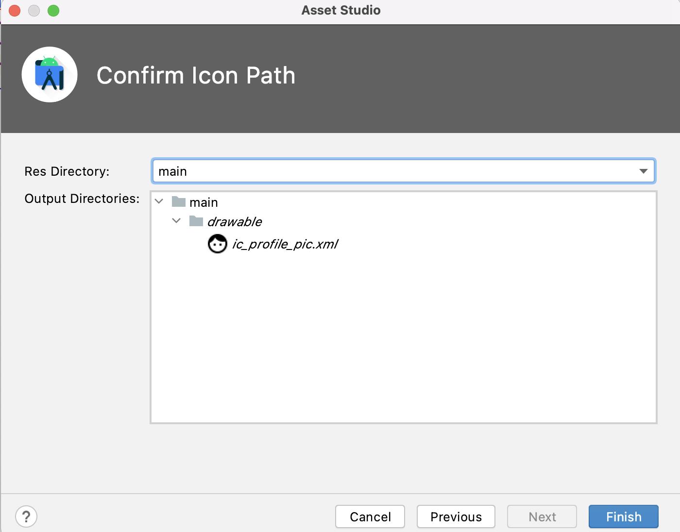
Step 3: Add a drawable icon which you will use in step 4.
rename and click 'finish'.
Step 4: Add the following code to the custom view component layout file you created in step 2.
<?xml version="1.0" encoding="utf-8"?>

<androidx.constraintlayout.widget.ConstraintLayout xmlns:android="http://schemas.android.com/apk/res/android"
    xmlns:app="http://schemas.android.com/apk/res-auto"
    android:layout_width="match_parent"
    android:layout_height="match_parent">
    <TextView
        android:id="@+id/profile_name"
        android:layout_width="wrap_content"
        android:layout_height="wrap_content"
        android:layout_marginTop="8dp"
        android:text="John Doe"
        android:textSize="16sp"
        android:textStyle="bold"
        app:layout_constraintLeft_toRightOf="@id/profile_image"
        app:layout_constraintTop_toTopOf="parent" />

    <TextView
        android:id="@+id/profile_role"
        android:layout_width="wrap_content"
        android:layout_height="wrap_content"
        android:text="Junior Developer"
        app:layout_constraintLeft_toRightOf="@id/profile_image"
        app:layout_constraintTop_toBottomOf="@id/profile_name" />

    <androidx.appcompat.widget.AppCompatImageView
        android:id="@+id/profile_image"
        android:layout_width="50dp"
        android:layout_height="50dp"
        android:layout_margin="8dp"
        android:src="@drawable/ic_profile_pic"
        app:layout_constraintLeft_toLeftOf="parent"
        app:layout_constraintTop_toTopOf="parent" />
</androidx.constraintlayout.widget.ConstraintLayout>
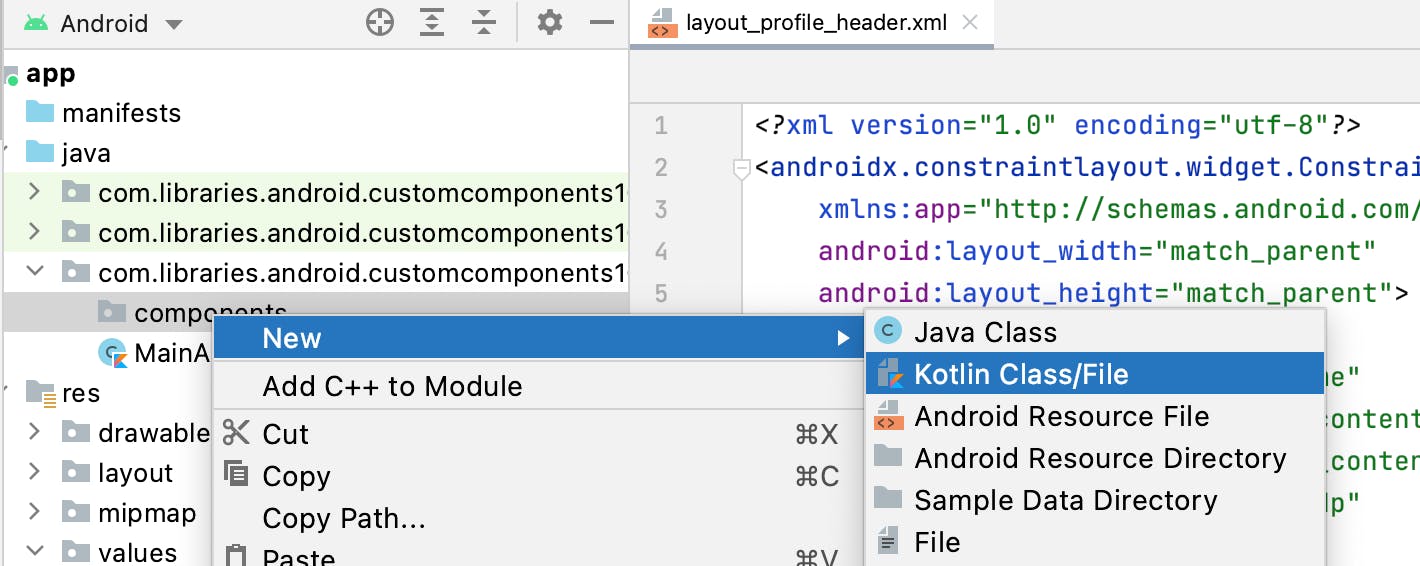
Step 5: Create a file that will point to the custom view component layout file and name it ProfileHeader.kt (this will be the name of your custom component, you will see this in step 6).
Bonus step 5.1:
Since Kotlin Synthetics has left the chat 😭 I refuse! to findViewById, what is this? the stone age?..
A perfect alternative is to use Android's Jetpack feature View Binding 🥳.
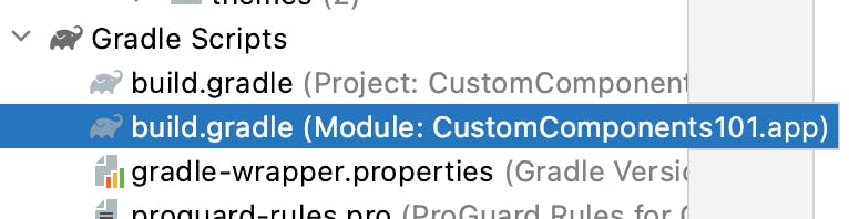
Lets go ahead and enable it!😋 Go to the module's build.gradle file
and add this piece of code inside the android tag
  buildFeatures{
         viewBinding true
     }
..and sync your project...
Perfect! You now have view binding enabled.
What I love about this feature is that, you do not have to add any special tag in your layouts like you would when using Data Binding (don't confuse the two siblings, okay?). All your layout files are covered. To learn more about view binding😃, check the doc.
Now, lets continue with the class...
Add this piece of code.
class ProfileHeader @JvmOverloads constructor(
    context: Context,
    attrs: AttributeSet? = null,
    defStyleAttr: Int = 0,
    defStyleRes: Int = 0
) :
    ConstraintLayout(context, attrs, defStyleAttr, defStyleRes) {

    val binding: LayoutProfileHeaderBinding =
        LayoutProfileHeaderBinding.inflate(LayoutInflater.from(context), this, true)

}
I kid you not, if you miss anything here, your custom view component will not inflate properly resulting in compilation errors. Pay attention to the constructor and the viewbinding (if you cannot find your layout binding class, rebuild your project).
For this lesson, we will not do anything with the binding variable. In this case we are just inflating the layout - layout_profile_header.xml.
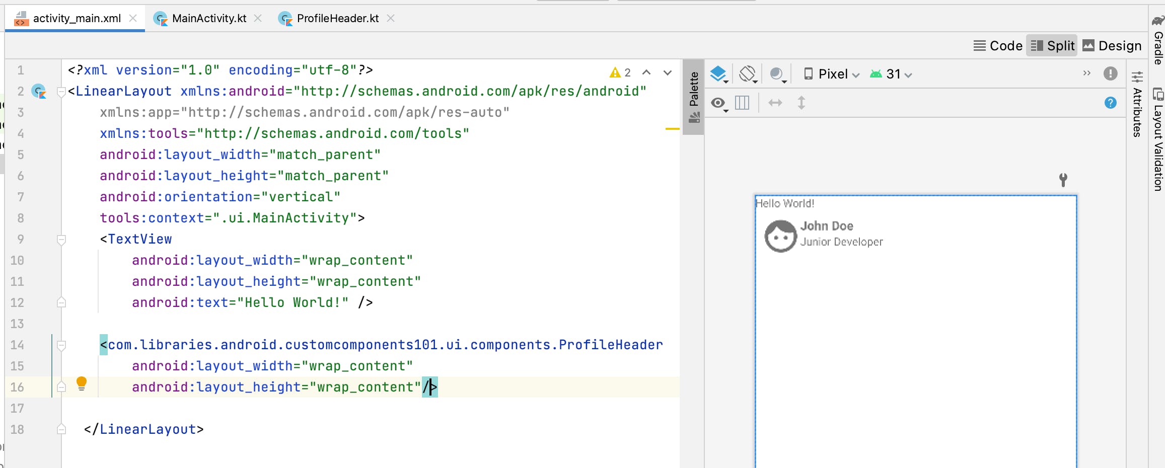
Step 6: Plug in your custom view component in any other layout.
Go to activity_main.xml (or any layout of choice) and add it there. Just like you would add a button or textview, search for the name of your class (step 5) - which is the name of your new custom view component and walah there you have it!
<?xml version="1.0" encoding="utf-8"?>
<LinearLayout xmlns:android="http://schemas.android.com/apk/res/android"
    xmlns:tools="http://schemas.android.com/tools"
    android:layout_width="match_parent"
    android:layout_height="match_parent"
    android:orientation="vertical"
    tools:context=".ui.MainActivity">
    <TextView
        android:layout_width="wrap_content"
        android:layout_height="wrap_content"
        android:text="Hello World!" />

    <com.libraries.android.customcomponents101.ui.components.ProfileHeader
        android:layout_width="wrap_content"
        android:layout_height="wrap_content"/>

  </LinearLayout>
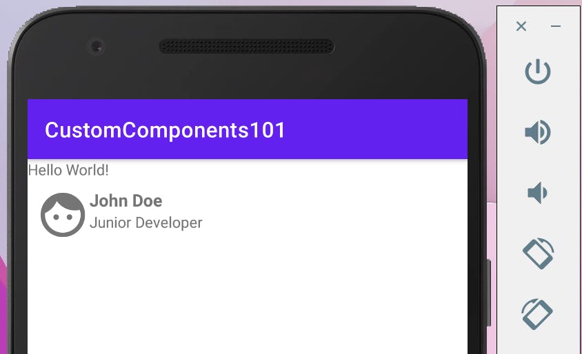
Your layout should look something like this
Step 6: Run the app
..and you are done! 🥳
I hope you had fun reading!
Stay tuned for part 2 where you will learn how to make this a bit more customisable. 🙂🥂